The Pan/Core-genome curves are calculated from Pan-genome Orthologous Groups (POGs) in the data sets.
- For generating “Pan-genome”, please visit here.
- For Pan-genome Orthologous Groups, please visit here.
The figure below shows the Pan/Core genome curve obtained from the results of Pan-genome analysis of 16 Vibrio cholerae genomes. The number of POGs (shown as boxplot) represents the distribution of values of the entire data set obtained by randomly selecting the amount of genomes on the X-axis, 100 times each.
- Blue boxplot and trend line shows the change in number of Pan-genome gene groups to the number of genomes.
- Green boxplots and trend line shows the change in number of Core-genome gene groups to the number of genomes.
The Pan-genome curve (1) shows a positive correlation between the number of POGs and the number of genomes. In contrast, the Core-genome curve (2) shows a negative correlation where the number of POGs decreases as the number of genomes increases.
In the case of Core-genome, it can be calculated by using several different cutoff settings. The cutoff setting specifies the calculation of Core-genome by using genomes with certain genes that are above X% of the genomes in the entire data set. For example, Pan-genome analysis of 10 genomes with the cutoff setting at 100% results in core-genome that includes only the genomes with all of the certain genes. If the cutoff setting is at 90%, 9 or more genomes among the 10 genomes that has all of the certain genes will be included in the core-genome.
The figure below shows the calculated plot curve with two different cutoffs for the POG number of Core-genome.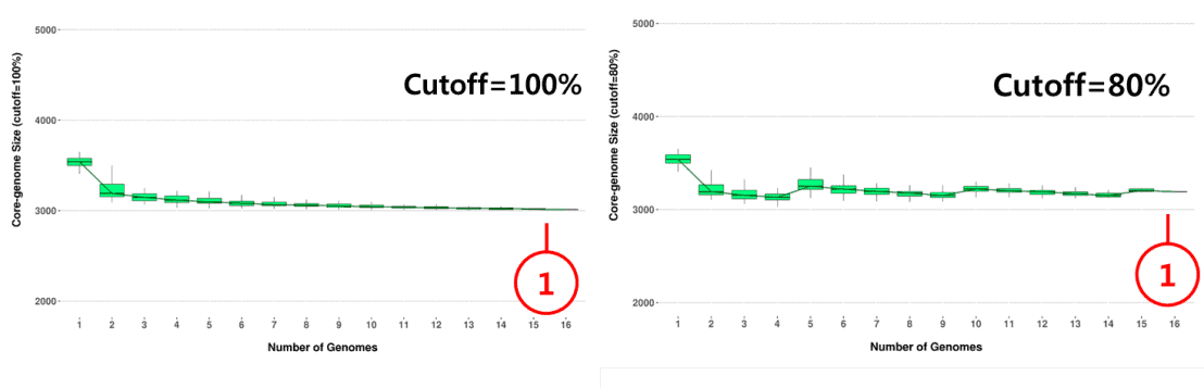
- Overall, you can see that the number of POG that belongs to the core-genome increases as the cutoff % gets smaller.
Last updated on May 24th, 2016 (EK)

