In this tutorial, we will work with you to compare human respiratory samples between diseased and healthy subjects to get you familiarized with EzBioCloud’s microbiome taxonomic profiling (MTP).
The data used in this tutorial was published in 2014 by Hana Yi et al. Since it is a part of the EzBioCloud microbiome database, we will start by checking out this dataset into your MTP account.
If you don’t have an account, please register first.
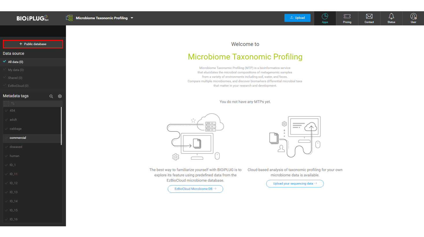
Go to the Microbiome Taxonomic Profiling (MTP) service page
At EzBioCloud’s main page, click [Apps], then Microbiome Taxonomic Profiling (MTP).
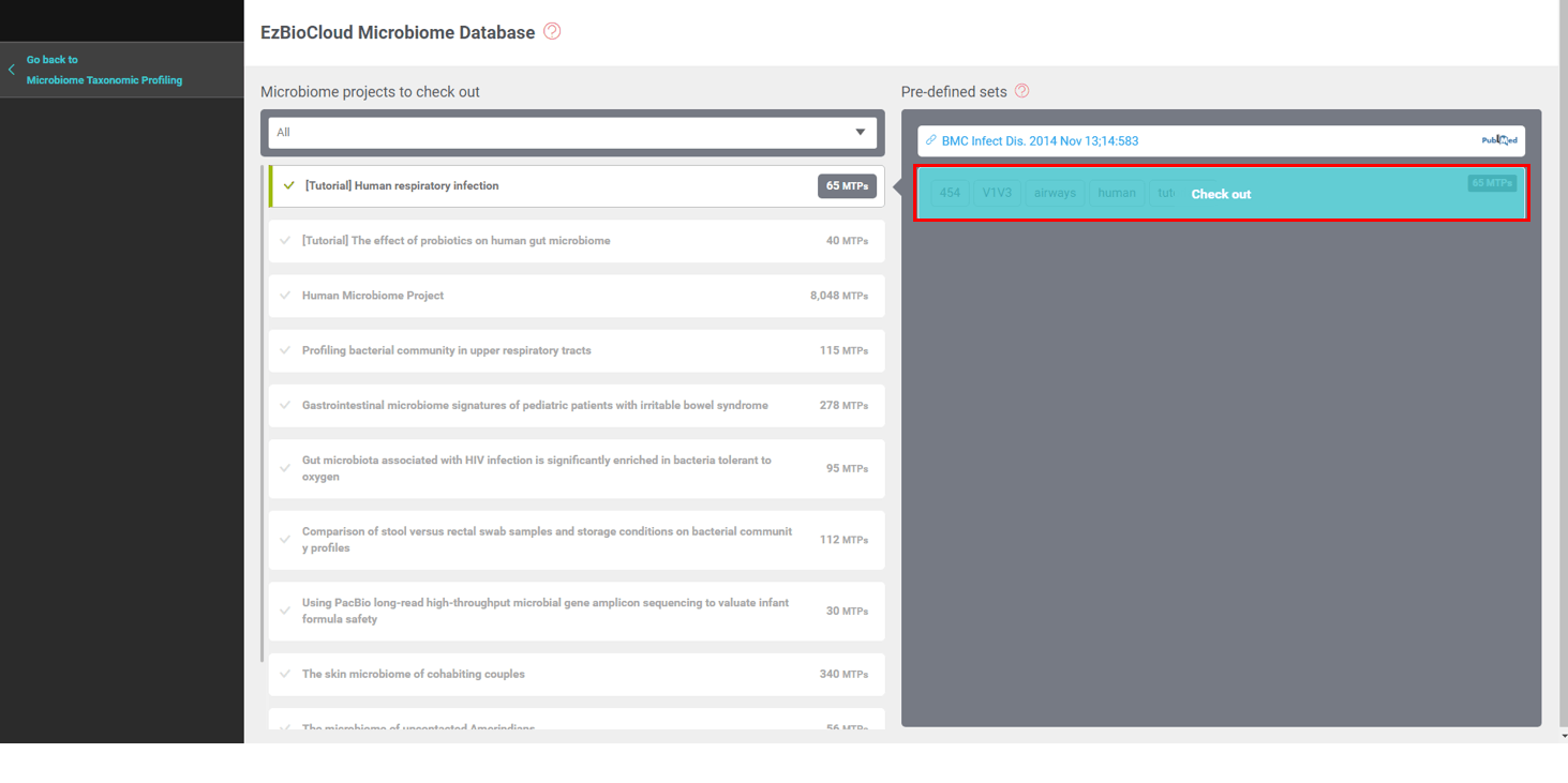
Open [EzBioCloud DB]
EzBioCloud DB contains many datasets that you may incorporate into your analysis. The database is constantly growing, including the Human Microbiome Project (HMP)‘s 8,048 MTPs of 19 body sites.
Please check out the “[Tutorial] Human respiratory infection” data set which contains 65 MTPs.
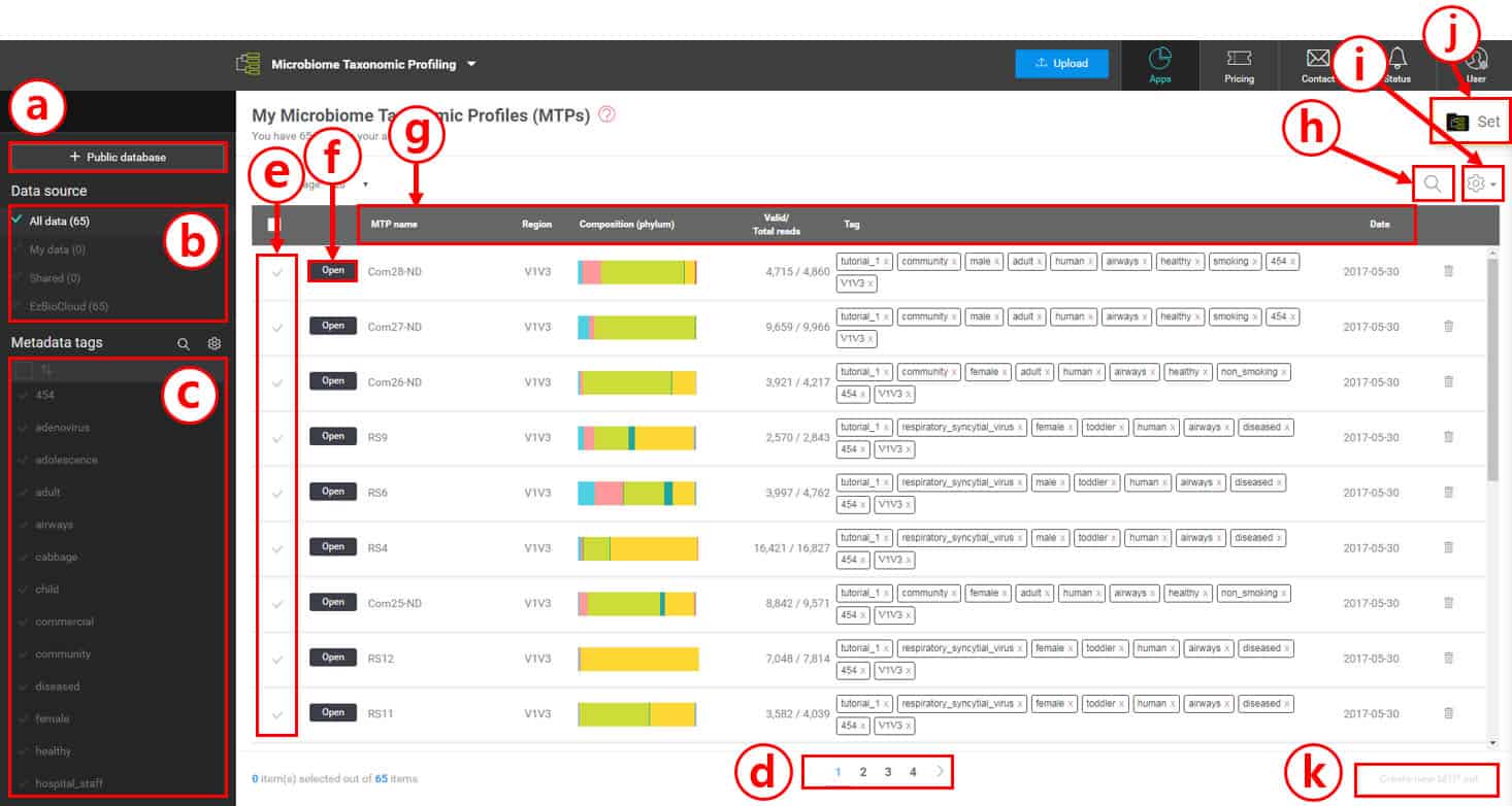
Browsing MTPs in your account
Because you checked out a tutorial set, there should be 65 MTPs with metadata tags. Since we are going to handle a large number of microbiome samples, metadata tags will play a critical role in organizing data and discovering biomarkers or differentially present taxa. We will start in the MTP’s browsing page below.
This EzBioCloud Microbiome Database contains many MTPs for you to include in your analysis. Our goal is to provide our customers with standardized, user-friendly microbiome datasets.
Your account can hold a large set of MTPs from different sources.
[My Data] – Your own data that have been processed by CJ Bioscience, Inc
[Shared] – Data that are shared by your colleagues
[EzBioCloud] – Data checked out from the EzBioCloud DB
Metadata tags in your account are listed here. By selecting tag(s), you can quickly and easily select MTPs that can be used to create an MTP set for further analysis.
In this example, 65 MTPs cannot fit into a single page. Here, you can navigate between different pages.
Select or unselect individual MTPs by clicking the check marks to create an MTP set.
By clicking [Open], you can access the “Single MTP Browser” for each MTP.
Various information about MTPs
“MTP name” is the name of the sample given by CJ Bioscience or data owners
“Region” is the sequencing region of the gene (e.g. V1 to V9 for 16S). You can hide this information in “Toggle columns (i)”
This displays a composition of phyla for quick comparison.
This column displays “Valid/Total reads”
“(Metadata) Tags” are terms that best describe the samples (MTPs). The combination of tags can be used to classify and group multiple MTP sets
“Date” is the date when the MTP was created by the EzBioCloud MTP pipeline (not the sampling date)
Search for MTPs in your account.
Toggle the settings to hide or display individual columns.
Go to “MTP set” if you have created one or more sets.
Create an MTP set after selecting multiple MTPs.
Examining a single MTP using the “Single MTP Browser”
Now, we have 65 MTPs of respiratory swab samples. Their bacterial community structure was elucidated by the amplification and sequencing of the 16S V1-V3 region using a Roche 454 platform. Because we used EzBioCloud’s 16S database, species-level identification of each sequencing read is possible. Each MTP contains the complete information of a sample’s bacterial community.
Open the MTP named AD1 (MTP ID=CL123S1) by clicking [Open]. By doing this, a new web page/tab will be opened to explore the bacterial community of this sample. According to the tags, it is a respiratory swab sample of a male infant who has an adenovirus infection.
In the browser for this MTP, you will find the following information about the AD1 sample under the “About MTP” tab:
The number of total reads after quality filtering was 6,091 reads.
There were 18 reads that had been amplified non-specifically. These were found to be of the non-16S regions.
88 chimeric amplicons were detected and excluded.
Therefore, the number of valid reads is 5,985 with an average length of 481.6 bp.
92.5% (5,539 reads) of the valid reads were identified at the species level by EzBioCloud 16S DB and CJ Bioscience’s pipeline. A total of 83 species were discovered in this sample.
Under the “Alpha diversity” tab, you should be able to obtain the species richness (the estimated number of species in a sample) and species evenness (or diversity index).
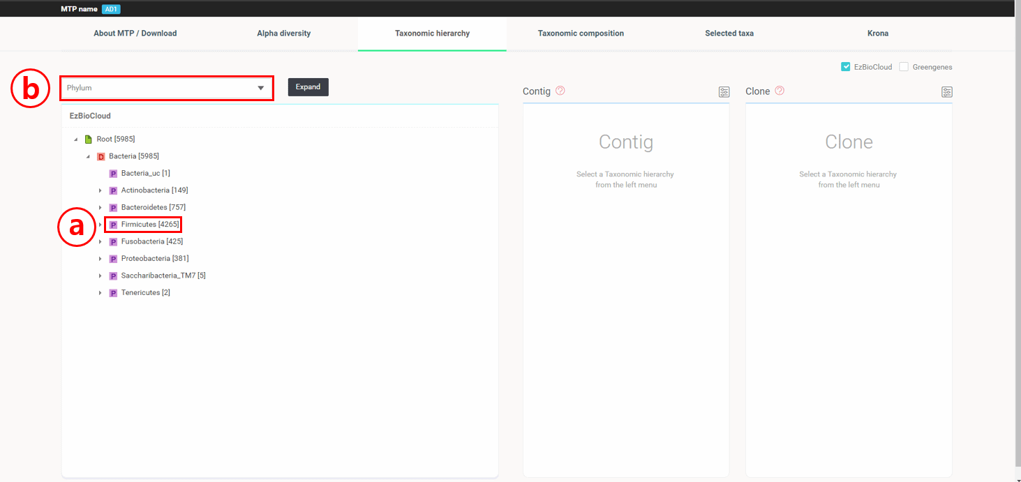
Under the “Taxonomic Hierarchy” tab, 16 reads are displayed along with their taxonomic hierarchical structure.
4,265 reads belong to the phylum Firmicutes. You can expand the tree by clicking the gray triangle on the left of the taxon name,
or expand and reveal all tree hierarchy by selecting “Species” and clicking the [Expand] button.
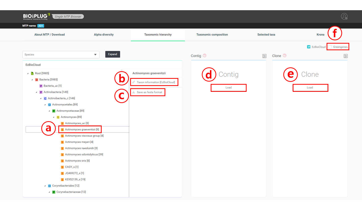
Now, we have a fully expanded taxonomic hierarchy. Let’s say that we wanted to examine a species further. Using Actinomyces graevenitzii as an example, select “Actinomyces graevenitzii” which is under Actinobacteria (phylum); Actinobacteria_c (class); Actinomycetales (order); Actinomycetaceae (family); Actinomyces (genus).
Click on Actinomyces graevenitzii to pull up the necessary menu.
Click here to visit the taxon’s page at the EzBioCloud database. Let’s take a look at EzBioCloud’s page for Actinomyces graevenitzii by clicking (b). EzBioCloud’s database provides a variety of taxonomical and biological information about a taxon, as well as its abundance in the healthy human body sites. The chart describing the relative abundance of Actinomyces graevenitzii in human body parts indicates that this species is found in around 1% of human oral habitats (see here).
Click here to download all sequences that were identified as Actinomyces graevenitzii in a FASTA format.
Click [Load] to load contigs that were identified as Actinomyces graevenitzii. Here, contigs are the groups of sequences that are thought to be of the same template, and are therefore identical sequences.
Click [Load] to load clones that were identified as Actinomyces graevenitzii. Clones are those that were not clustered into “contigs”.
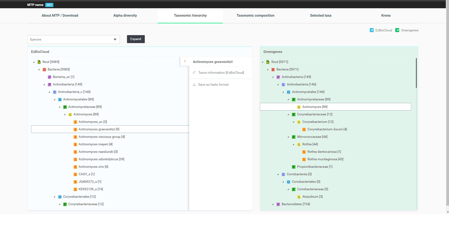
If you check the box for “Greengenes”, an analogous taxonomic hierarchy of the same sample that was analyzed by an open source piepline with Greengenes database will be displayed side by side for you to compare. The image below displays the differences between two database/pipeline results for the genera Actinomyces and Corynebacterium.
Under the “Taxonomic composition” tab, quantitative compositions of all taxonomic ranks (phylum to species) are given as tables and pie charts. You also have the option of downloading the data as an Excel file for your own analyses. In the AD1 sample, the most abundant species was “Streptococcus salivarius group” (14.6%), followed by “Streptococcus pneumoniae group” (10.8%) and Veillonella dispar (8.6%). A “taxonomic group” contains multiple species/subspecies that can not be differentiated by 16S due to the low resolution of the gene. Click “Streptococcus salivarius group” to go to the web page describing the member species of this group.
Click here to go to the web page for the taxon
Click here to download the data as an Excel file
Under the “Krona” tab, taxonomic compositional data are loaded onto the Krona tool, which is an open source visualization project available at //sourceforge.net/p/krona/home/krona/.
Any MTP can be opened and browsed in the ways described above.
Creating MTP sets
One of the major goals of microbiome studies is to understand the taxonomic profiles of a set of samples. An MTP set is defined as a set of MTPs in EzBioCloud. You can easily create sets manually, or semi-automatically using the (metadata) tags.
In this tutorial set, we can create sets of different combinations of tags. Let’s create two sets that are defined as “Healthy” and “Diseased”, respectively.
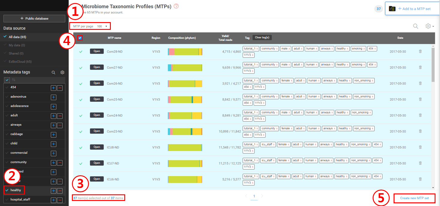
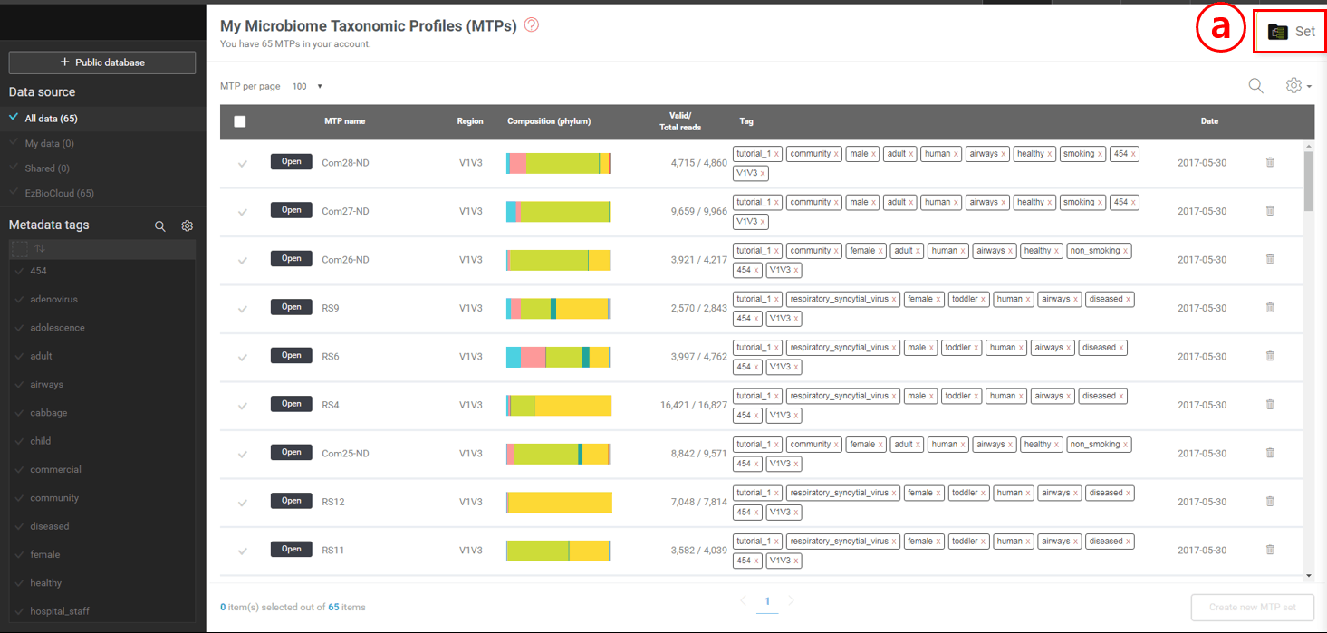
First, set “MTP per page” to 100 to view all selections in a single page.
On the tag panel (left), check the “healthy” tag to select only MTPs with this tag.
You will see that only 37 MTPs (with”healthy” tag) are now listed.
Select all 37 MTPs by checking this box.
Click [Create new MTP set] to create an MTP set. Let’s label it as “Healthy”.
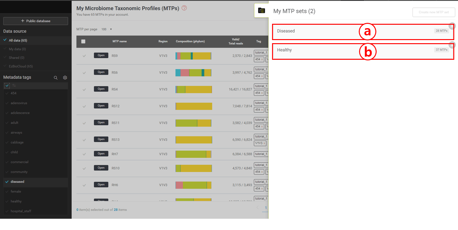
In the same way, create an MTP set with “Diseased” tag. This set should contain 28 MTPs (see below).
“Diseased” set contains 28 MTPs
“Healthy” set contains 37 MTPs
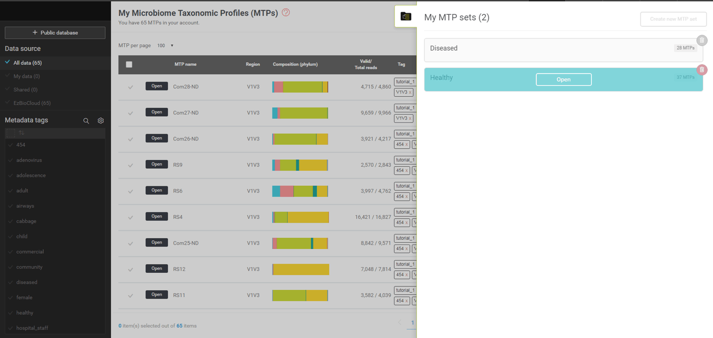
To browse the microbiome information of an MTP set, move the mouse cursor to the box representing sets (a,b of the above screen shot).
By clicking this tab, you can pull up the menu that allows you to select MTP sets.
Opening an MTP set
An MTP set contains multiple MTPs that can be considered as a set in many statistical analyses. We have already created two MTP sets, “healthy” and “diseased”, in the previous exercise. Let’s open the “healthy” set first, which contains 37 16S based taxonomic profiles of respiratory tract swabs of 37 healthy subjects. Bring up the list of MTP sets ((a) in the previous screen shot) and move the cursor to the “healthy” set. You should see the [Open] button which will lead you to the “MTP set browser” (see screenshot below).
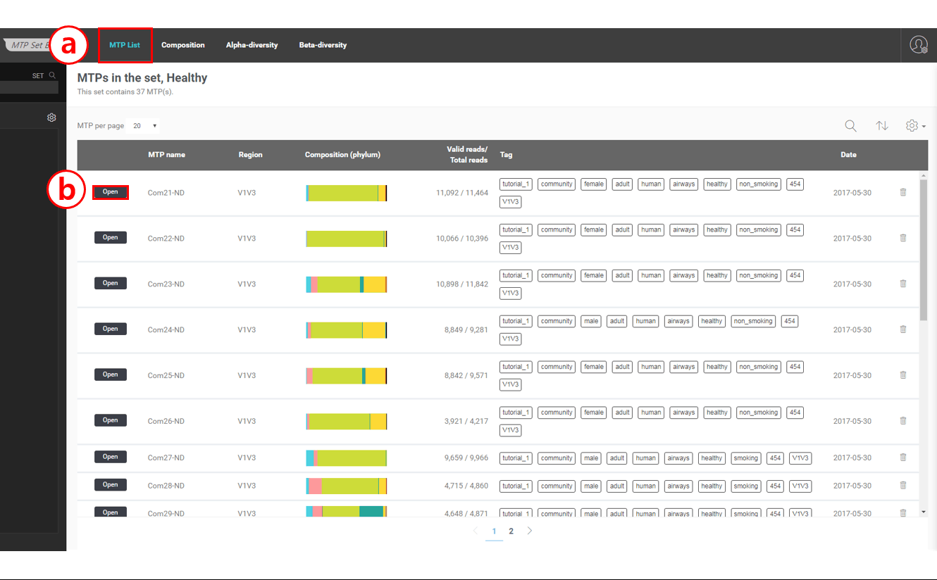
The image below is a screen shot of the MTP set browser showing the “healthy” set
Main menu
Click [Open] to access the Single MTP Browser which allows you to explore the data of each MTP
There are four menu items in the main menu:
MTP List: This menu will show the list of MTPs in this set
Composition: This menu will provide you with the statistics of the taxonomic compositions of the set
Alpha-diversity: This menu will give you the statistical summary of alpha diversity indices of the set
Beta-diversity: This menu will give you analytics for beta diversity (the relationship between MTPs)
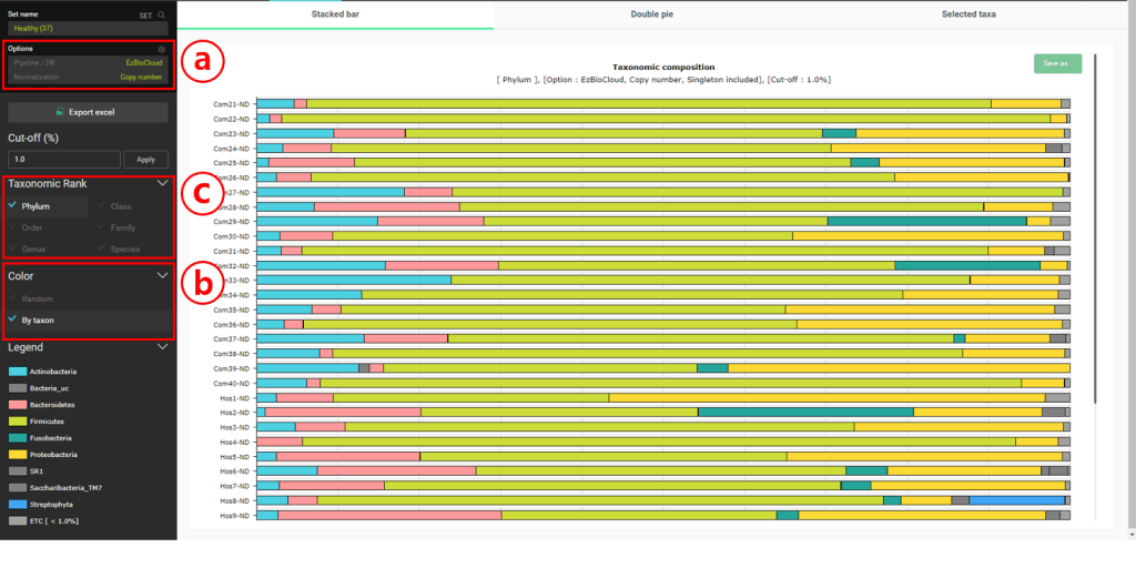
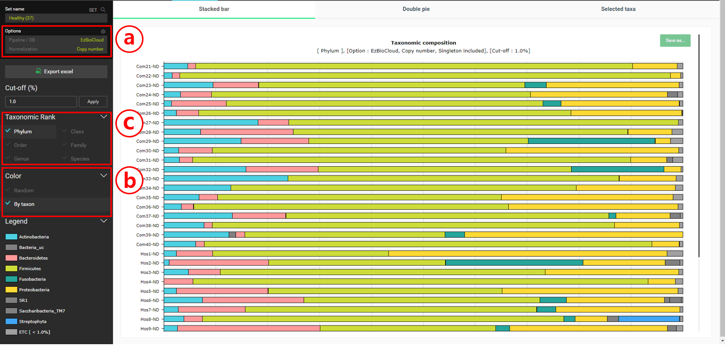
Select the “Composition” menu to the “Stacked bar” chart
Set the Normalization to “Copy number”. This will allow us to consider the copy numbers of 16S genes when we calculate the statistics on taxonomic compositions.
Set the Color to “By taxon” to make sure that the same taxon is displayed in the same color in different MTPs.
Change the taxonomic rank for the charts.
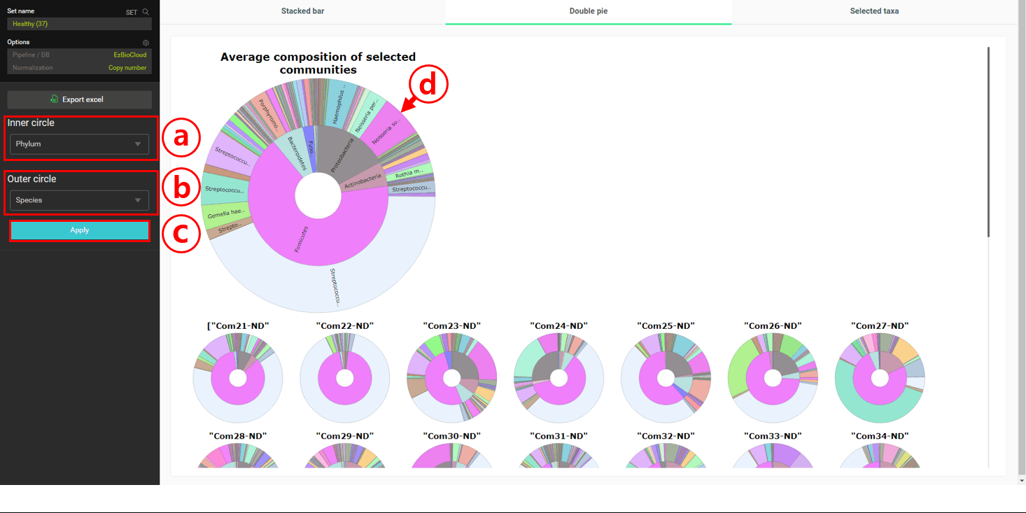
In the healthy subjects, it looks like Firmicutes is most abundant at the phylum level. At the species level, “Streptococcus pneumoniae group” seems to be the most abundant. Let’s confirm this by viewing the “Double pie chart”.
In this chart, the averaged taxonomic compositions of two taxonomic ranks of your choice are given.
Set the inner circle to “Phylum” rank.
Set the outer circle to “Species” rank.
Click [Apply].
The averaged compositions are now updated for the “double pie chart”. Move the cursor to display the full name of taxa on the chart.
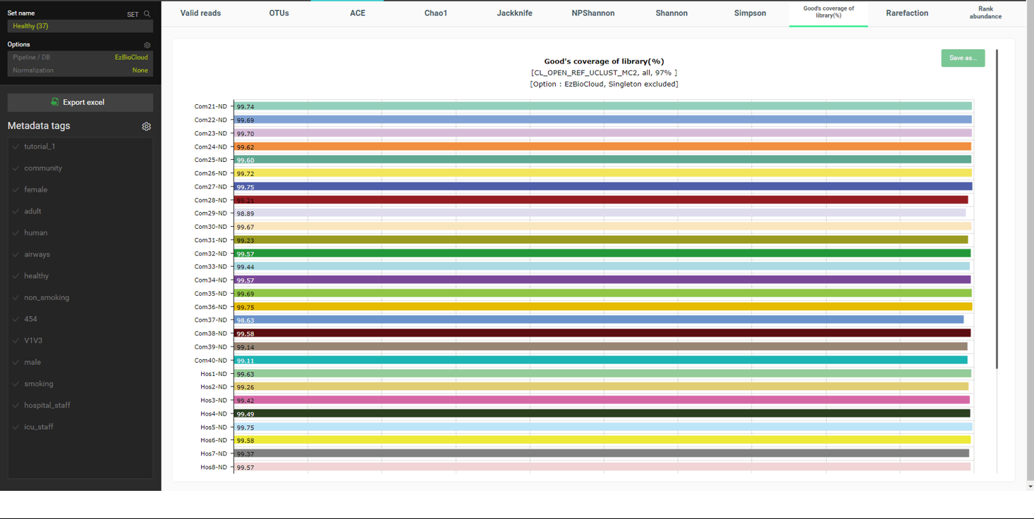
Under the “alpha diversity” menu, various diversity indices are given for all MTPs in the set. For example, “Good’s coverage of library” indices for all MTPs are close to 100%, indicating that the numbers of sequencing reads per sample were statistically sufficient (below screen shot).
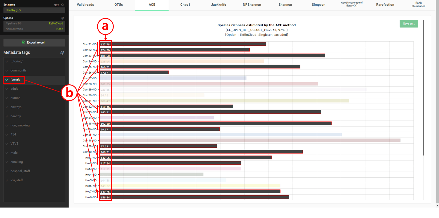
Under the “alpha diversity” menu, ACE, Chao1, and Jackknife give the estimated number of species, called species richness, in the samples. Under the “ACE” tab, the estimated number of species (=OTU) in each MTP are listed as a bar chart.
The number here indicates the estimated number of species within each sample (=MTP).
If you select tag(s), only the MTPs with those tag(s) will be highlighted. In this example, only “female” tagged MTPs were highlighted; no clear characteristics were found with “male” tagged MTPs.
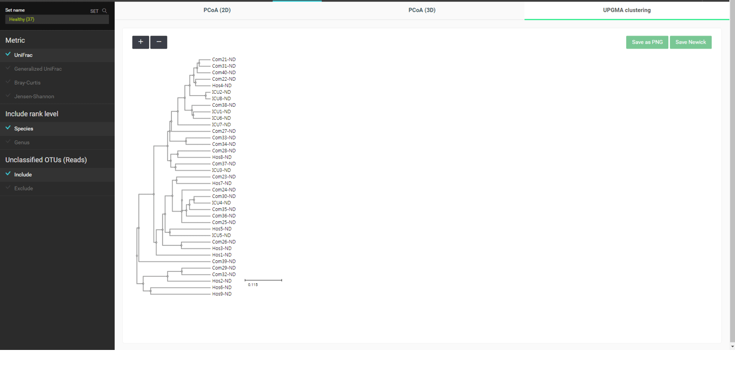
Under the “beta diversity” menu, relationships among samples are explored using different statistical and visualization methods. The most popular distance metric between two MTPs is a “UniFrac”. All distances are calculated for each pair, which are then used to carry out a hierarchical clustering or dimension reduction by principal coordinate analysis (PCoA). The below is the UPGMA clustering of MTPs in the “healthy” set using UniFrac distances:
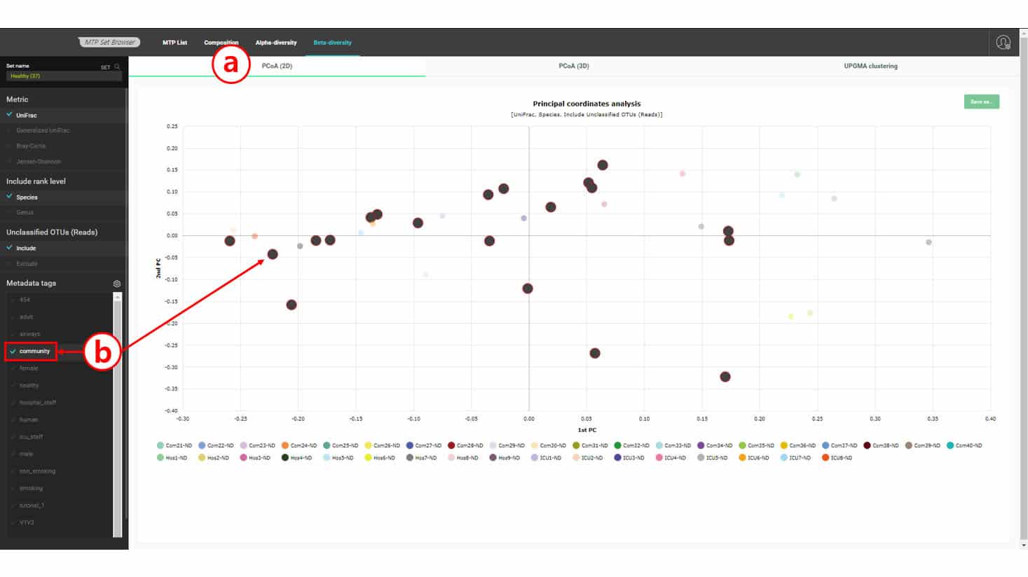
In this dataset, we have three types of “healthy” subjects: Com-X-ND (Community subject, non-diseased), Hos-X-ND (Hospital staffs, non-diseased) and ICU-X-ND (intensive care unit staffs, non-diseased). In the above UPGMA dendrogram, we do not see a clear separation among the three groups. Because hierarchical clustering sometimes produces a biased result, we can confirm this by using an ordination method by PCoA. Please select the “PCoA (2D)” tab to view the 2-dimensional scattergram of 37 healthy subjects. By selecting a tag or multiple tags, we can highlight the MTPs with a certain combination of tags.
Draws a 2-dimensional scattergram based on the 1st and 2nd principal components
Selecting tag(s) will allow you to examine the relationships of MTPs with certain tags. In this chart, community subjects are not coherently placed together, confirming the UPGMA clustering result.
Comparing multiple MTP sets for species diversity
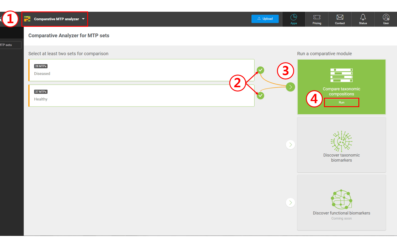
Our ultimate goal is to discover biomarkers that differentiate microbiomes with different characteristics. In this example, we want to know the bacterial species that are differentially present in “diseased” subjects. To do this, we start with the two MTP sets that we’ve already created, labelled “healthy” and “diseased”. To begin the comparative analysis, follow the steps below:
Select “Comparative MTP Analyzer”
Select two MTP sets
Select “Compare taxonomic compositions”
Click [Run] to launch the comparative module
The module for the “Comparative MTP Analyzer” is very similar to the “MTP Set Browser”; the former will compare the statistics of sets whereas the latter will focus on the individual MTPs in a set.
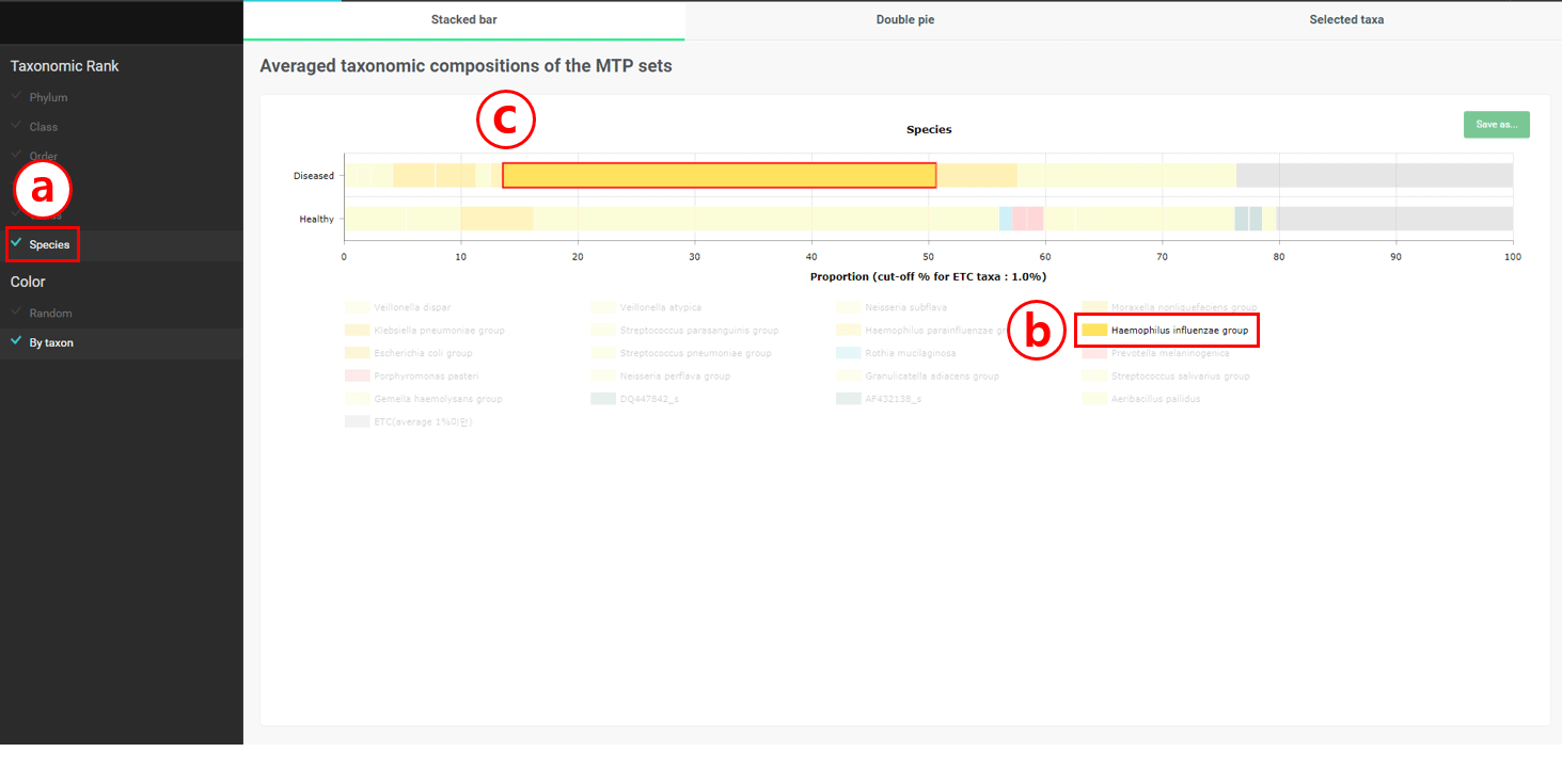
Select “Species”
Select “Haemophilus influenzae group”
Check that “Haemophilus influenzae group” is only present in “Diseased” set. We have found at least one species that are present only in the respiratory samples of diseased people.
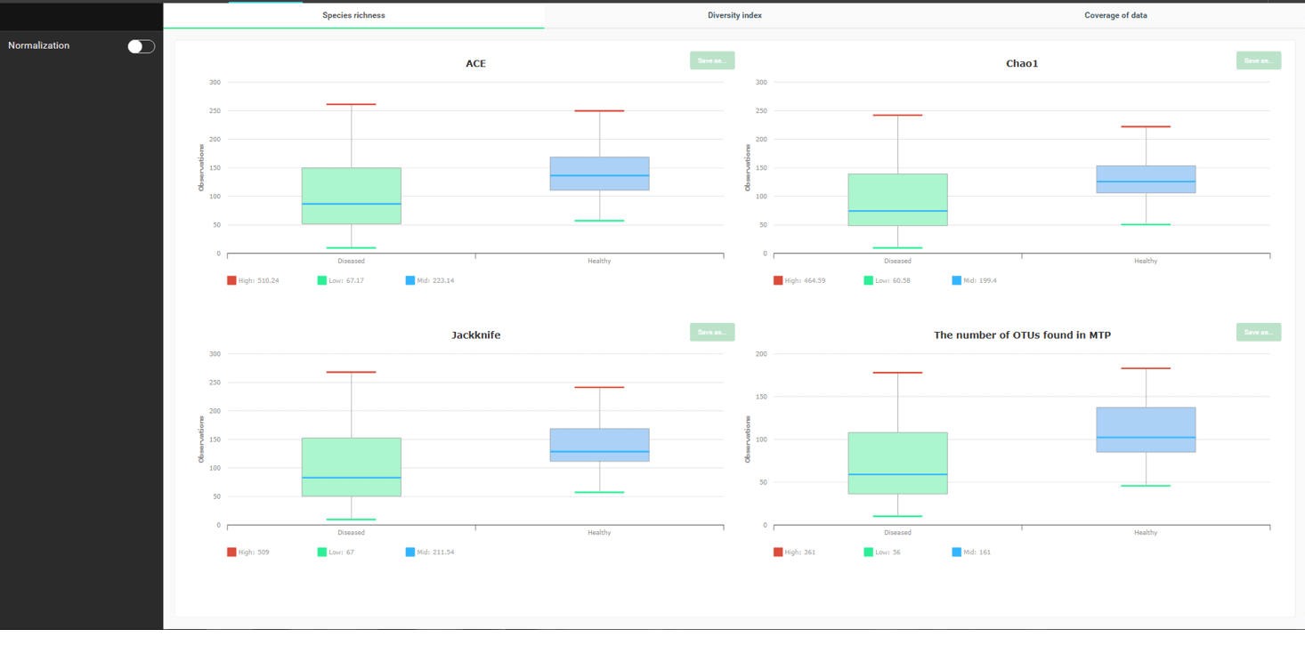
It is well known that the number of species and species diversity are reduced in the diseased. Let’s find out if this is true. Please select the Alpha-diversity menu to see the below:
All species richness indices (ACE, Chao1, Jacknife) indicate that the number of species in “healthy” is generally higher than “disease”. “The number of OTUs found” is dependent on how many reads you sequenced, so don’t try to give it too much meaning.
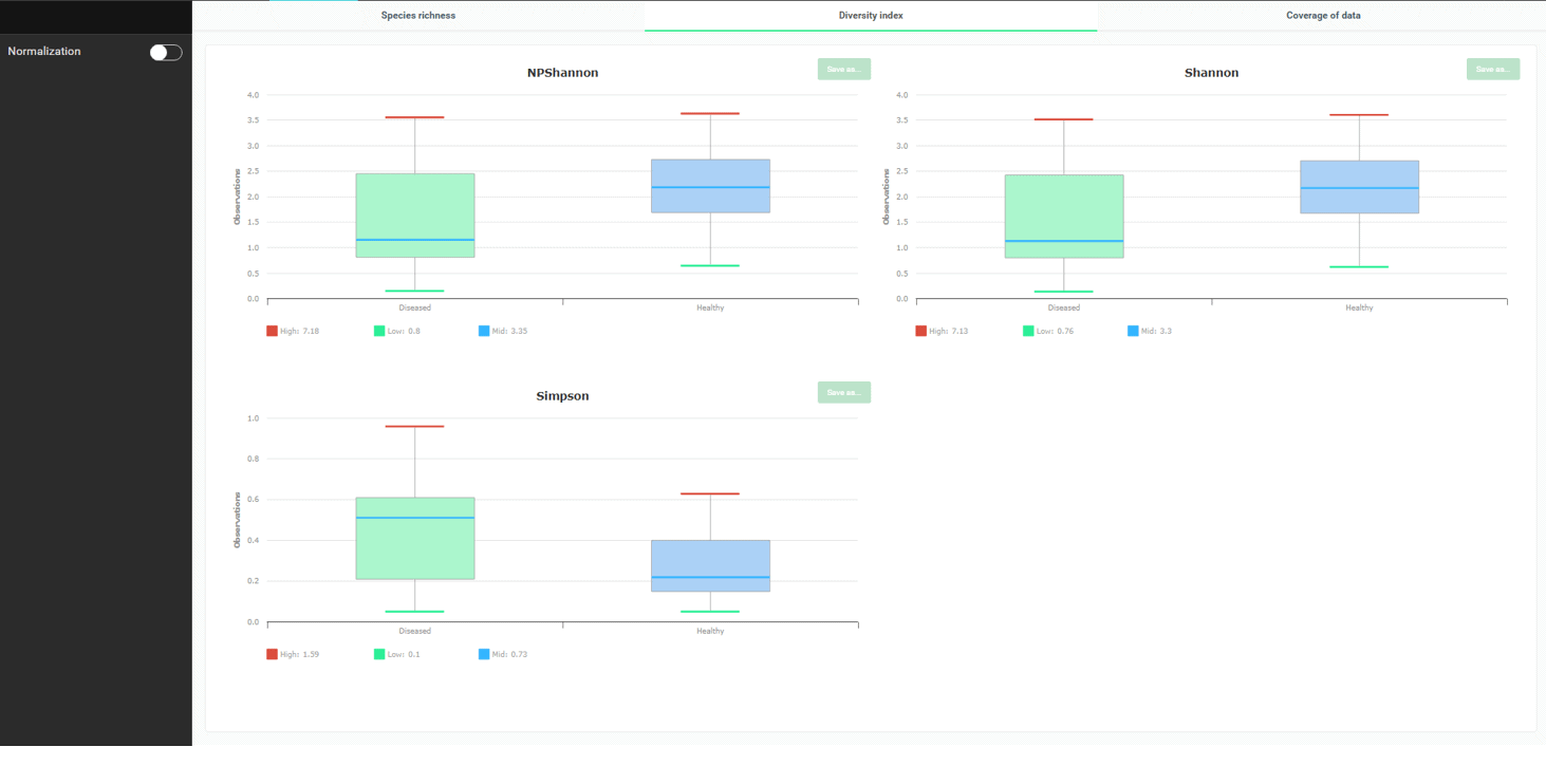
Okay, so now we know that there are more species in the healthy subjects. How about diversity or how evenly species are distributed in the swab samples? To check this, go to the “Diversity Index” tab.
The three diversity indices clearly display that more species diversity is apparent in the healthy. Please note that for NPShannon and Shannon, higher values correlate to more diversity. For the Simpson index, it is inversely related.
Comparing multiple MTP sets to unravel their relationships
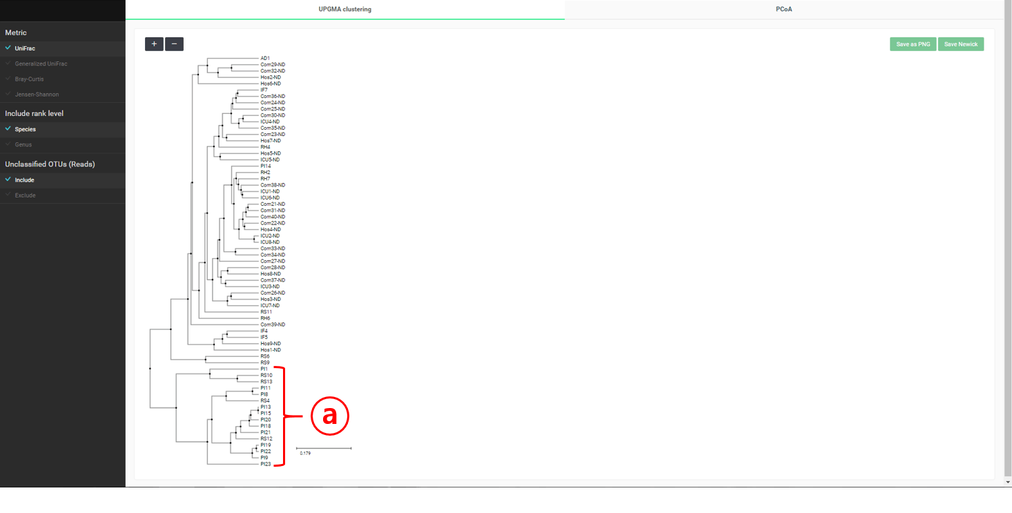
If you start the “Beta-diversity” menu of “Comparative MTP Analyzer”, two tabs will appear. The “UPGMA clustering” will give you a dendrogram containing all MTPs in both the “healthy” and “diseased” sets (see below).
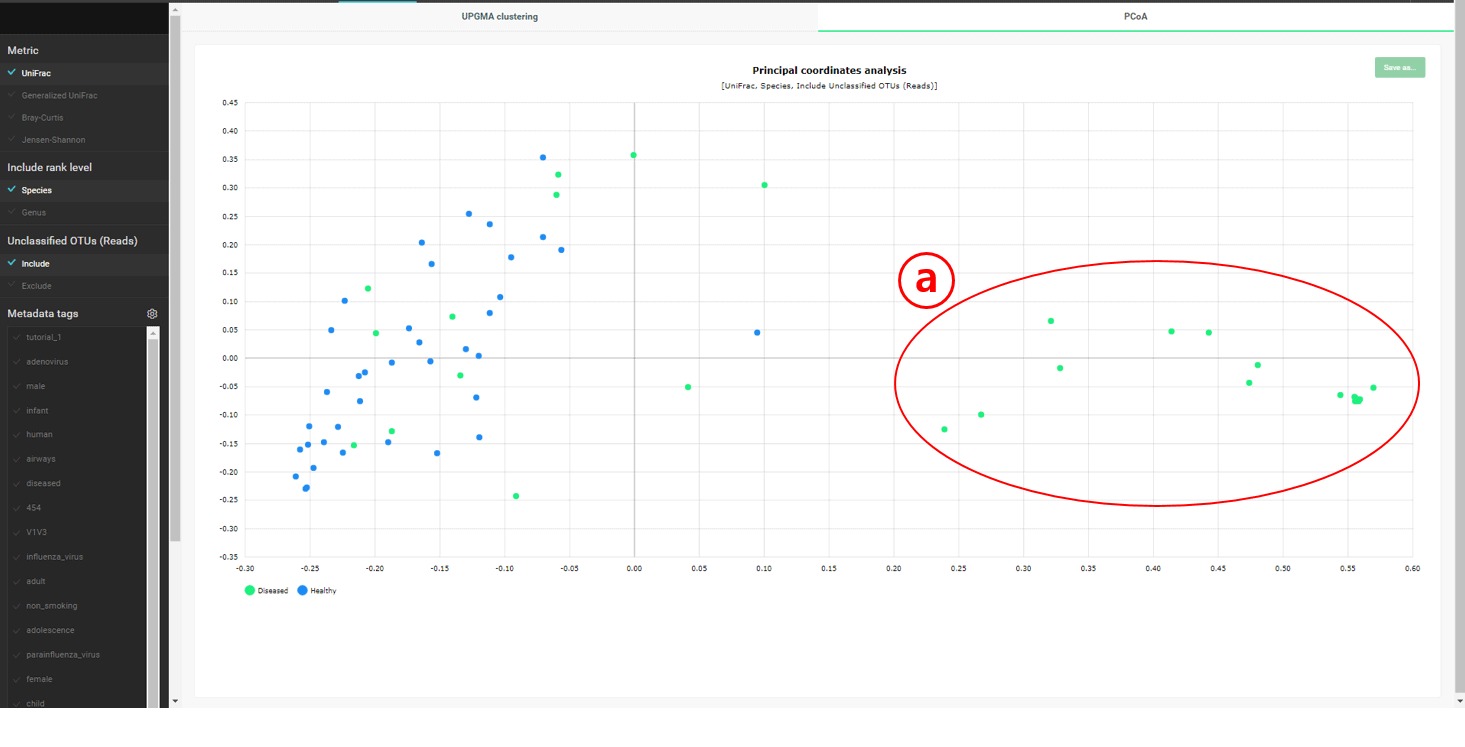
A cluster containing only “diseased” subjects is identified. This cluster is also apparent in the “PCoA” plot below.
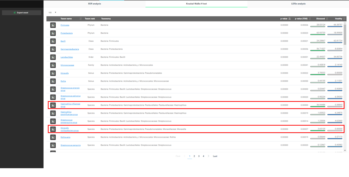
Finally, we want to mine our data to find what the major differences are between the two conditions. EzBioCloud provides multiple methods for discovering biomarkers. Here we will use the “Kruskal–Wallis H test” to find who is associated with respiratory diseases. Please select the “Biomarker Discovery” menu.
Differentially present taxa, from phyla to species, are listed in the order of p-value. Please note that “Haemophilus influenzae group”, which we already found before, is listed.
It is very interesting to find that “Moraxella nonliquefaciens group” is only found in the “diseased” samples while not detected in the healthy.
Closing
There are almost infinite ways of exploring microbiome data if you are equipped with proper bioinformatics tools and computational infrastructure. In EzBioCloud’s cloud environment, we try to provide instantly responding tools for comparative analysis, visualization, and data mining. We hope you enjoyed this tutorial and that you’ve familiarized yourself with EzBioCloud’s unique user interface.
Kimchi is a traditional side dish made from salted and fermented vegetables. When the fermentation is right, the pH of the cabbage kimchi reaches ~4.2.